Web Platform
8) Spot Viewer – RMS Velocity, Temperature and RMS Acceleration History
Updated at 3/7/2023
The telemetry data (continuous data) of vibration and temperature are obtained based on the sample interval configured for each sensor within its respective spot. This interval is configurable in “Spots Creation / Configuration” and is visible in the vibration and temperature data history screen, called the Spot Viewer.
Note: the most common way to access this screen is via the “Dashboard DMA”.
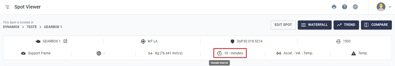
Based on this interval, vibration graphs (RMS velocity and/or RMS acceleration) and contact temperature will be presented, where each measurement was obtained precisely according to the time set in the interval.
As will be shown below, this type of chart allows for basic monitoring of a machine’s operating levels, quickly pointing out any deviation from the expected standard.
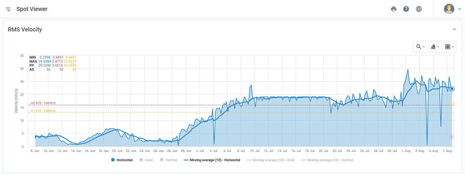
RMS Velocity
Just below the header shown in the image above, the first vibration graph is displayed: the RMS velocity graph, presented in triaxial form, i.e. in the three axes. In the footer, by clicking on the name of each axis, you can activate or deactivate the displayed axes by clicking on it.
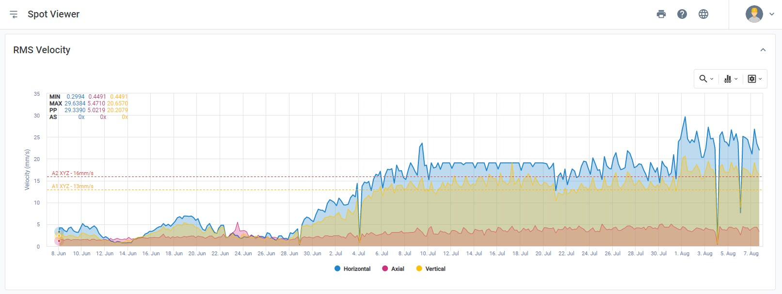
Figure: Graph of RMS velocity chart over time per axis
Note: the yellow and red dotted lines correspond to the alerts configured for this point. For more details, see the link.
Temperature
Below the RMS velocity chart the temperature graph is exhibited with values also measured based on the sample interval.
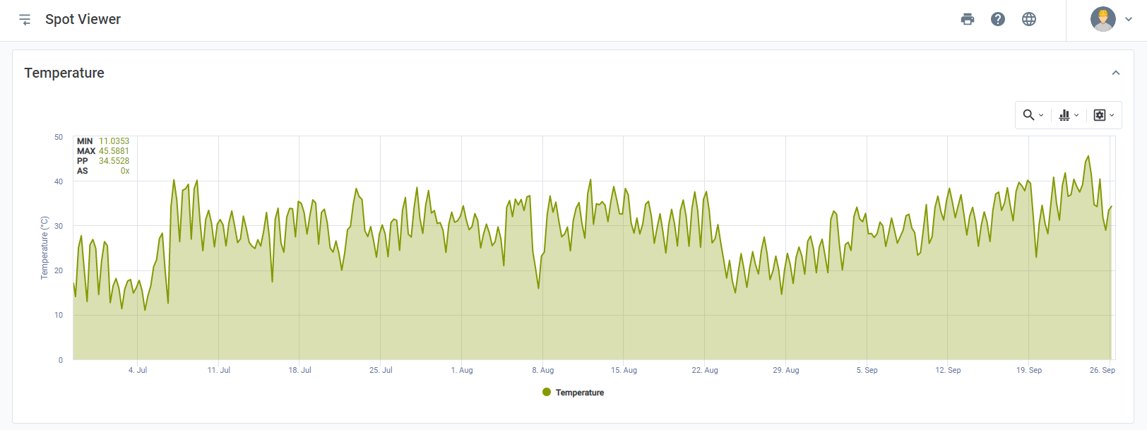
Figure: Temperature graph over time
RMS Acceleration
Finally, at the bottom of the page, the RMS acceleration graph is displayed. This is another way to track the vibration levels of the monitored asset.
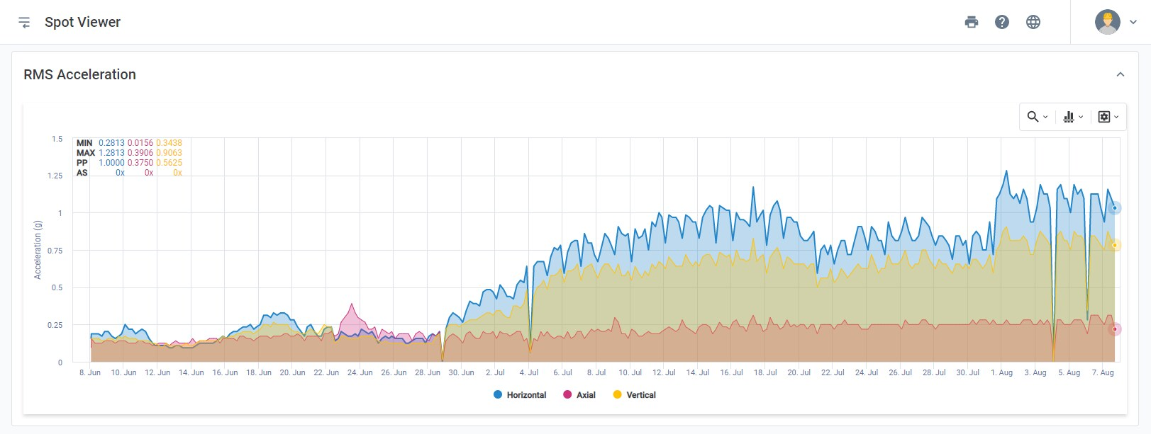
Figure: Graph of RMS acceleration chart over time per axis
Note: once again, the alert levels configured in the yellow and red dotted worksheets can be seen. Note that in this case, the monitored machine presents a strong evolution of vibration levels, even passing the configured alarm levels.
Using the function box, present in the upper right corner of the chart, you can access the following tools:
1) Zoom Tools
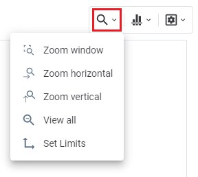
Picture: Zoom Tools
The zoom tools can be used to view a specific part of the graph. Zooming can be done directly on the axis (horizontal X/Vertical Y) or both at the same time (XY window). The default zoom is set to ‘horizontal’. To set axis limits for zooming, select ‘Set Limits’. To return to the original view, select ‘View All’.
2) Analysis Tools
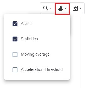
Picture: Analysis Tools
- Alerts – Plots alert levels A1 and A2 on the chart. This option will only be available in Spots that have previously defined alerts.
- Statistics – Displays the maximum, minimum, and peak-to-peak RMS velocity values for the selected period;
- Moving Average – Used to smooth out short fluctuations and highlight long-term trends. Below is an example of an RMS velocity graph with moving average enabled for the axial axis.
- Acceleration Threshold – allows you to plot the minimum and maximum acceleration thresholds configured in Spot creation, to check the instants when the machine is operating under stress or moments of stopped machinery.
3) Viewing Options
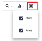
- Grid – Plots the grid lines at significant intervals on the graph;
- Area – Adds or removes the color filling below each line of the graph.
Back to articles